
 EN
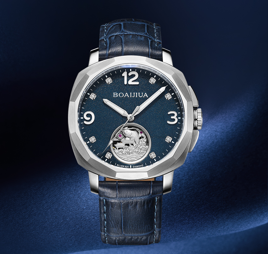
A dial prototype lands on the bench and the first instinct is to hold it under a lamp and judge the surface. That order is backwards. The surface is the most expensive thing to change and the least likely to be the real problem. A dial that looks dull under one lamp may be fine under another. A dial that looks bright may hide a geometry error that only shows up when the part is seated in a case. Experienced reviewers start with the features that cannot be adjusted later and work outward toward the finish.
That approach changes the whole conversation. Instead of debating whether the blue is right, the review starts with the dial feet, the center hole, and the marker seats. If those are off, the surface discussion is premature. If those are sound, the surface review has a stable base. Prototype review is a sequence, and the sequence matters as much as the checklist.
The Three Misreads That Sink a Prototype Review
Most prototype review problems come from three predictable misreads. Naming them upfront keeps the meeting short.
Judging color under a single light source. A dial that matches under a warm lamp can shift under daylight or a cool LED. Color has to be checked against a retained standard under a defined light, not by memory.
Treating a clean first article as proof of process. One good part shows the design is possible. It does not show the process can repeat. A prototype review should ask what changed between pieces, not just whether one piece passed.
Confusing texture softness with texture failure. A sunburst that reads softer at the center may be a lighting angle, or it may be a coating that filled the grooves. The two look similar in a photo and have completely different causes.
None of these misreads are exotic. They happen because the review jumps to appearance before it establishes geometry and process stability.
Geometry Checks That Cannot Wait Until Later
The geometry of a dial is not glamorous, but it decides whether every later step works. Dial feet position and height control how the dial sits in the case. Center hole position controls whether the texture and the printed track share an axis. Marker seat depth controls how applied indexes sit. None of these can be corrected after plating or lacquer without scrapping the part.
| Review target | Why it matters | How it gets missed | Practical check |
|---|---|---|---|
| Dial feet | Dial sits flat, no rocking | Looks fine loose, fails when seated | Height gauge, seating trial |
| Center hole | Texture and print share an axis | Passes diameter, fails position | Position check against dial edge |
| Marker seats | Index height and shadow line | Depth checked, position skipped | Depth gauge plus position check |
| Texture depth | Coating can fill fine grooves | Looks fine before lacquer | Raking light before and after coating |
The table is not a ranking. It shows why each geometry item has a specific failure mode that a general visual check will not catch. A dial can pass a flatness check and still rock in the case because one foot is slightly short.
A Case Where the Surface Was Fine and the Feet Were Not
A desensitized example from a dial prototype review: a brand received a prototype with a brushed finish and a printed track. Under the review lamp, the dial looked consistent. The texture was even, the print was sharp, and the color matched the reference. The prototype was almost approved.
The problem surfaced during a seating trial. The dial rocked slightly when placed on a flat reference plate. One dial foot was a few hundredths of a millimeter short. The error was invisible on the bench and would have been invisible in a photo. In a case, it would have shown up as a dial that sat uneven, and the brand would have blamed the case or the movement ring. The fix was a foot height correction and a seating trial added to the prototype checklist. The surface was never the issue. The review had simply started in the wrong place.
Texture and Color Need Two Different Lights
Texture review and color review are often done under the same lamp, which is a mistake. Texture reads best under raking light, where a low angle exaggerates groove depth and surface direction. Color reads best under a defined, diffuse source where the surface texture does not skew the reading. Using one light for both means one of the two checks is compromised.
A practical review setup uses two stations. One station has a low-angle lamp for texture and edge breaks. The other has a controlled light box or a spectrophotometer for color. The dial moves between them. This sounds like extra work, but it separates two failure modes that are easy to confuse. A texture that reads patchy under raking light is a real defect. A color that reads slightly off under a warm lamp may be a lighting artifact. Keeping the checks separate keeps the conclusions honest.
Print and Markers Are the Last Place to Catch a Drift
Pad printing and marker setting sit at the end of the dial process, which makes them the last chance to catch a drift before the part is finished. Print registration relative to the center axis is the key check, not registration relative to the dial edge. A logo can be perfectly centered on the edge and still be off-axis, and the dial will read as misaligned once the markers are applied.
Applied markers add a second layer. Marker height and seat depth affect how the index casts a shadow under raking light. A marker that sits slightly high looks proud. A marker that sits slightly low looks sunken. Neither shows up in a straight-on photo. The prototype review should include a side-angle look and a height measurement on at least one marker per quadrant.
What the Review Should Hand Off to Production
A prototype review that ends with "looks good" hands nothing to production. A useful review ends with a short list of what will be checked, at which stage, and against what standard. That list does not need to be long. It needs to be specific to the dial design.
Which dimensions will be checked in-process, and at what interval.
Which light source and which retained standard will define color acceptance.
Which texture features will be checked before and after coating.
Which print and marker positions will be measured against the center axis.
Small batches and large batches should follow the same list. A short run costs more per piece because setup is spread across fewer parts, but that is a commercial difference, not a reason to check less. The review is the moment the inspection plan gets written, and a written plan is what keeps a prototype from drifting into a batch surprise.
Burriva works at the component level on dials, cases, bracelets, and buckles. For dial prototypes, dial production covers blank machining, texture, plating, lacquer, pad printing, dimensional inspection, and multiple inspection rounds across incoming, in-process, and outgoing stages. Segregated workflows and CAD file access controls keep design files split by job role. Brands reviewing a watch dial prototype can contact the team to discuss dial specifications, surface requirements, and dial inspection points.